Chart of the Day
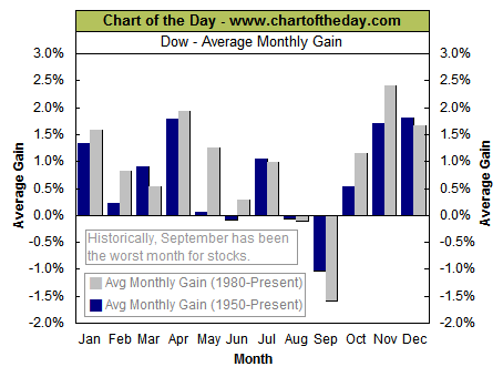
Chart of the Day reminds us September can be a cruel month.
Today's chart illustrates the Dow's average performance for each
calendar month since 1950 (blue columns) and 1980 (gray columns). What does the chart show? While the strongest upward bias in stocks has historically occurred during the November-January time frame, September has proven to be the most difficult month for stocks. It is interesting to note how the 1980-present average gain for September has remained negative despite the fact that most of this period included a strong bull market. Stay tuned...
posted by FRx at 1:31 PM
![]()
![]()

 subscribe
0 Comments:
Post a Comment
<< Home